Setup
I was assigned to improve the user experience of a web-based application that allows hospital managers to schedule and communicate with their staff. All designs were to fall outside of the application's main functionality.
Goals
Produce designs that significantly improve the application and can be actioned within 6 - 8 weeks.
Paths and constraints
- Gather insights into current user pain points.
- Produce designs that address user's most critical pain points.
- Reach consensus with stakeholders over plans of action.
- Steer away from producing any designs that would require more than tweaks to any apis the application consumes.
Pre-project
I spent time with available stakeholders to listen to their interpretations of where the software succeeds and what could be improved. There was some misalignment over the problem the application solves for its users.
After discussion, the consensus was that the application solves an issue for staffing managers by offering simplified workflows versus competitors.
I also spent time with the application's developers. The application's initial designers had moved on to work elsewhere. Developers were finding it hard to incorporate new features into existing layouts.
After discussion, the consensus was that the application solves an issue for staffing managers by offering simplified workflows versus competitors.
I also spent time with the application's developers. The application's initial designers had moved on to work elsewhere. Developers were finding it hard to incorporate new features into existing layouts.
Research
Firstly, I reached out to book two staffing manager users for interviews and usability testing. I then read through user help queries that spanned back three years.
I was able to isolate those which I considered to be "user issues."
User issues
- 34% of issues were down to a lack of understanding of the application's capabilities.
- 17% were navigation errors.
- The rest were system bugs or hard to label.
I would be able to draw upon this data for the upcoming usability testing and interviews. Capturing this information would also be beneficial when measuring outcomes.
User interviews
User interviews and usability testing took place in the workplaces of the staffing managers. Both were female nurses that had ended up working in a staffing office to move away from working actively in nursing. The users ranged between 40 and 55 in age. Both have a close working knowledge of the staff they manage. They use the internet frequently outside of work, for social media and consuming video entertainment.
Applications and websites they use on a regular basis inside and outside of work were - Google chrome, Gmail, Outlook, Microsoft Teams, YouTube, Netflix, Spotify, Facebook, Instagram, WikiPedia, Amazon, HubSpot and various news websites.
Both users found last-minute work cancellations of staff to be the most stressful part of their job. Both found they had less than adequate time to accomplish all their tasks within their role. Each user estimated they spend between 90 - 270 minutes per day solving issues related to last-minute changes in staff members' schedules.
Usability testing
- Users completed tasks that touched on core functionality quickly and without friction.
- Secondary tasks were an issue. Both users struggled to produce a custom report. One of the users relied upon pen a paper to write down and record events.
- Both users struggled to complete tasks when the task involved the user having to scroll up or down.
- Both users struggled when describing the application's terminology clearly.
- Both users expressed frustration when trying to roll back actions they had made.
- One of the users noted some frustration as they described how they felt when using the filters on a particular data table.
- One of the users struggled to maintain awareness of recent activity on the application and opted to refresh pages frequently.
Benchmarking (#1.1)
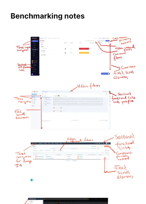
I benchmarked the application against several direct competitors within the market, several widely used applications with similar user goals, and some popular sites that came up during the user interviews.
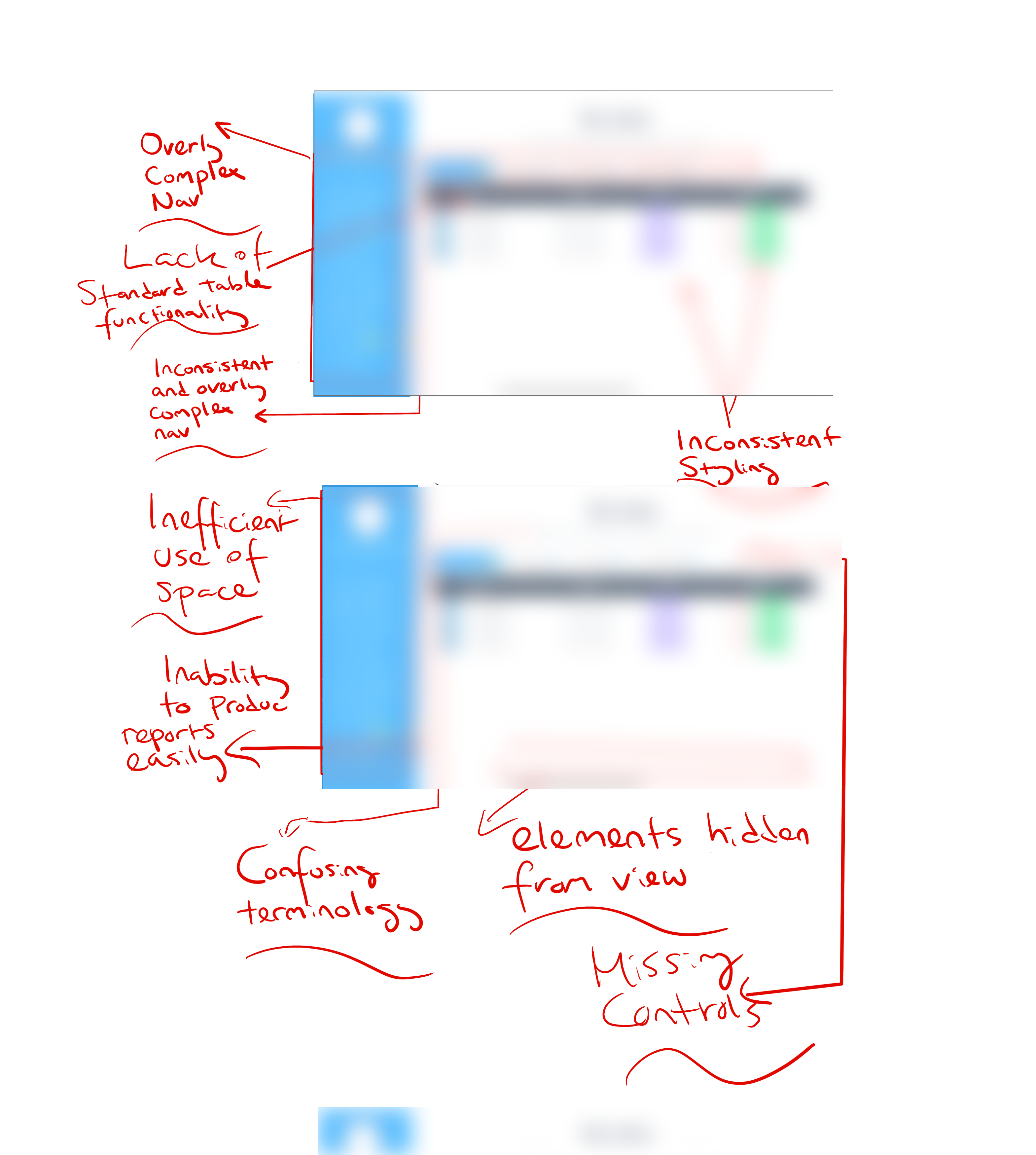
- Navigation and information architecture were more logical on other systems. The application had navigational links that were ordered by the dates they were developed as opposed to having much structure or priority.
- The application compared poorly with regards to the use of a cohesive style and incorporated more of a miss match of look and feel.
- Secondary functionality was presented in a nonstandard manner. For example, the way in which your produce reports or charts could differ from section to section.
- Terminology was more readily understandable on competitors' software.
My interpretations
- Users are not utilising features that would bring value to their day-to-day workflow.
- Users seem confused about the entire suit of features the system has to offer.
- Users seem unaware of many of the features the system offers.
- When users struggled to complete tasks they stopped working or moved directly to another system.
- The system compared poorly to analogous systems concerning user navigation, understandability, and design cohesiveness.
- New features were bloating the current information architecture and encroaching on the application's overall ease of use.
Sample workings
Benchmarking
#1.1
Establishing patterns
NOTES
Existing interface
#1.2
Noting shortcomings
NOTES

Design sketches
#1.3
Ideas, ideas, ideas
SKETCHES
Design
Sketches (#1.2, #1.3, #1.4)
Applying UX (#1.5)
I set about sketching ideas and creating material related to the points I'd deemed actionable.
The material created -
Before stakeholder meetings, transcripts from user interviews, screen capture video of usability testing, details of the help desk queries and benchmarking studies were shared.
The group used a combination of card-sorting and affinity maps to redesign the information architecture and settle on some tweaks to terminology. We agreed improvements could all be fit into three categories.
The material created -
- Visual descriptions for the current application issues.
- Possible elements to include in a redesign.
- Low fi mockups to help with stakeholder visualisation.
- Options for new colour, typography, viusal hiearchy and navigation.
Before stakeholder meetings, transcripts from user interviews, screen capture video of usability testing, details of the help desk queries and benchmarking studies were shared.
The group used a combination of card-sorting and affinity maps to redesign the information architecture and settle on some tweaks to terminology. We agreed improvements could all be fit into three categories.
- PerceivableUse consistent terminology, visual hierarchy, placement, navigation, and filters. Reduce complexity where possible.
- CompassionateRemove feelings of frustration users have when trying to perform edits, rollbacks, or understand the functionality.
- ScalableReduce the amount of work developers need to do when designing new features. Give them a solid layout framework from which to work on. Whole new sections should not need to be designed when adding most new features.
Applying UX (#1.5)
Applying broad user experience heuristics and principles can be useful when working under tight deadlines with limited resources. When trying to make an application more easily perceivable and consistent we can lean into Jackobs Law 1 and take insipration from popular designs with excellent ux. When trying to create a system that flows well, is communicative, friendly and sympathetic we can keep in mind of Hick's Law 2, the Pareto principle 3 and Miller's Law 4 for example.
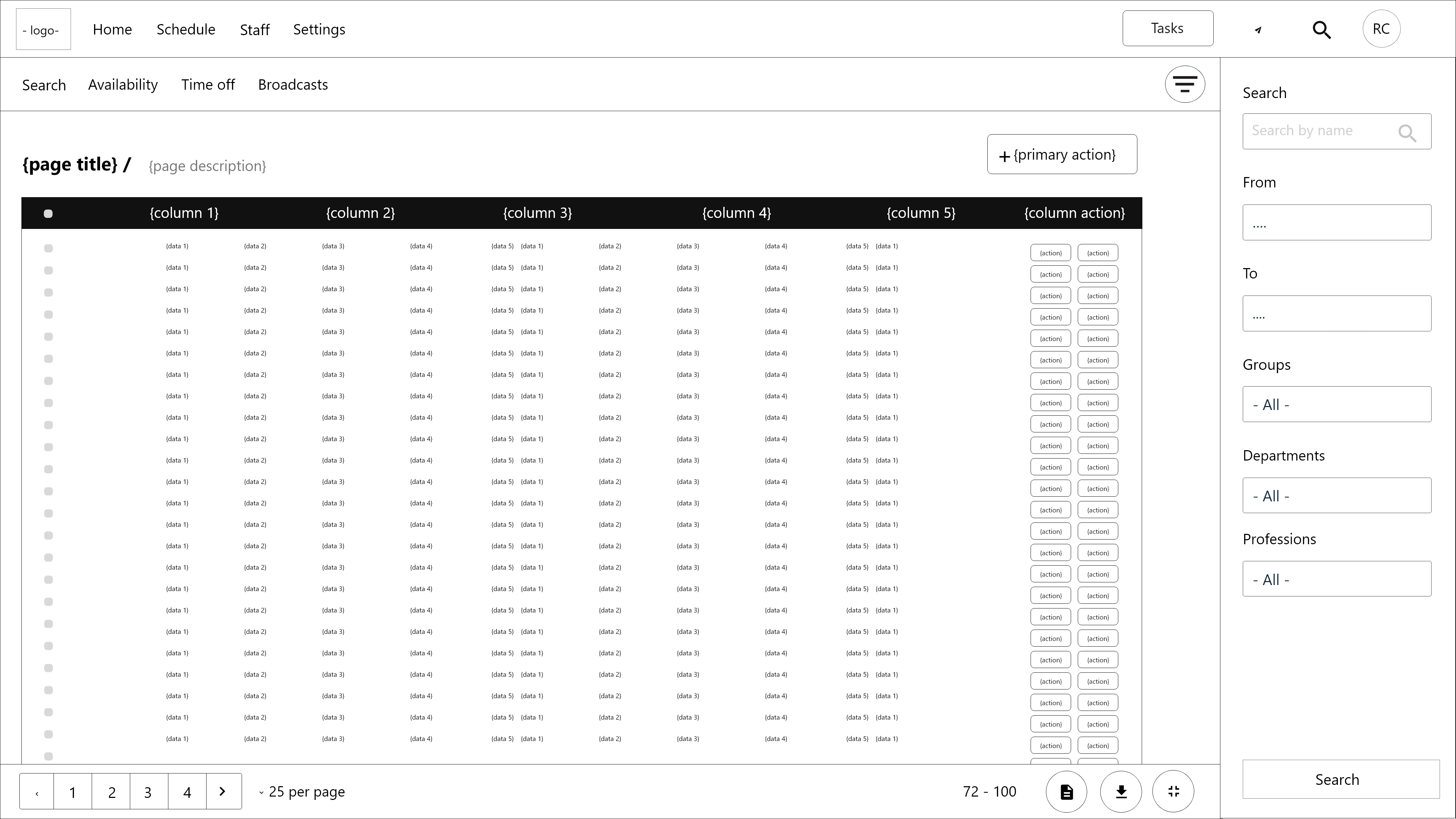
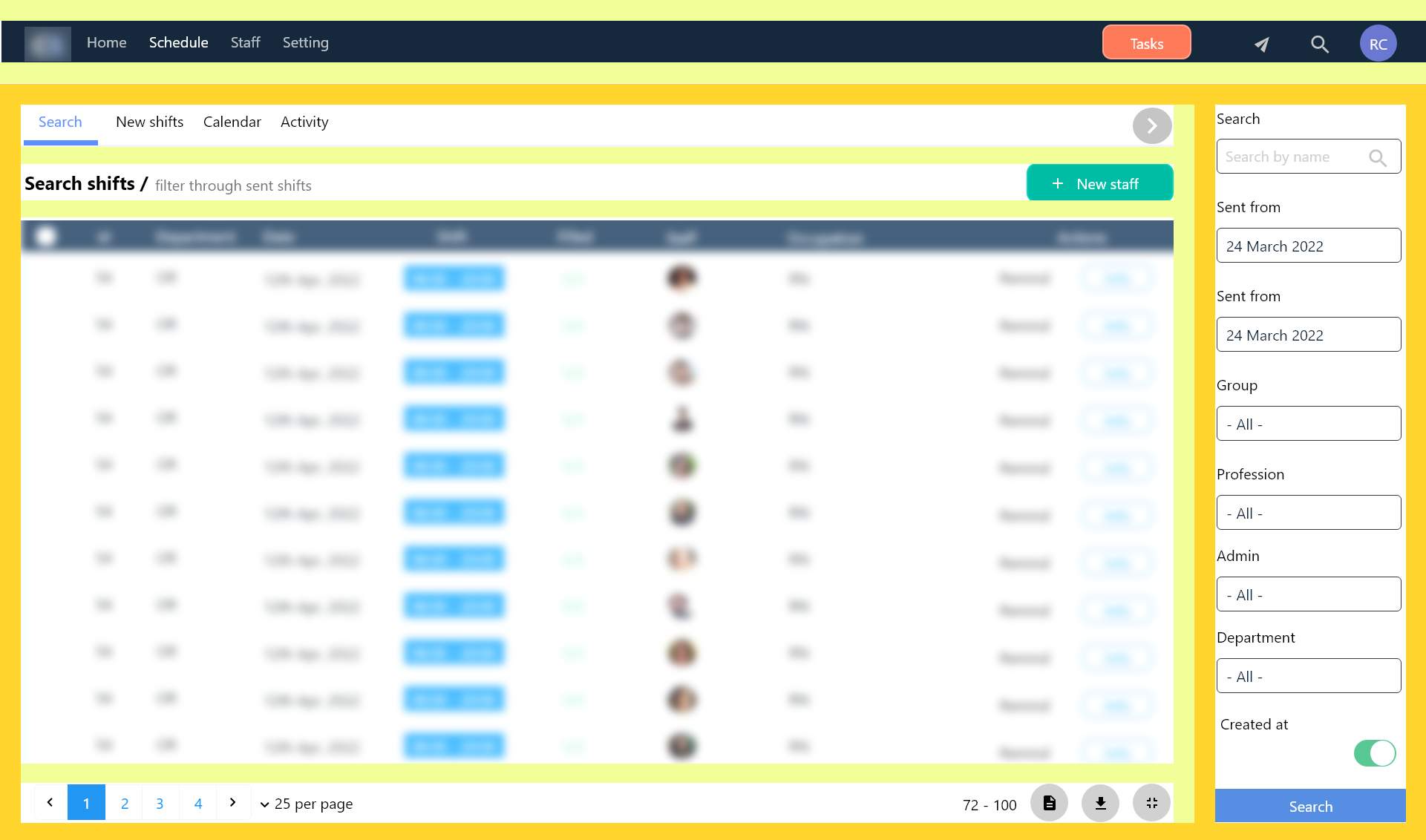
Wireframes (#1.6, #1.7)
Wireframes were provided that included a new navigation structure and information hierarchy. An overhaul to the way the system communicates with the user from tooltips, toasts, titles, popovers... all were reworked for functionality and tone. Secondary and tertiary functions were accounted for in a consistent more perceivable manner. Options and filters were trimmed down, allowing for simpler interfaces but keeping lesser-used complexity hidden but accessible. New colour, layout guides, and rough language rules were provided.
Post project
Clients were informed of updates via email and digital print material. Problems with the application that were uncovered but were out of scope for the redesign were added to the overall project roadmap for consideration. Client feedback is continually evaluated.

Sample workings
Layout
#1.5
Consistency
WIREFRAMES
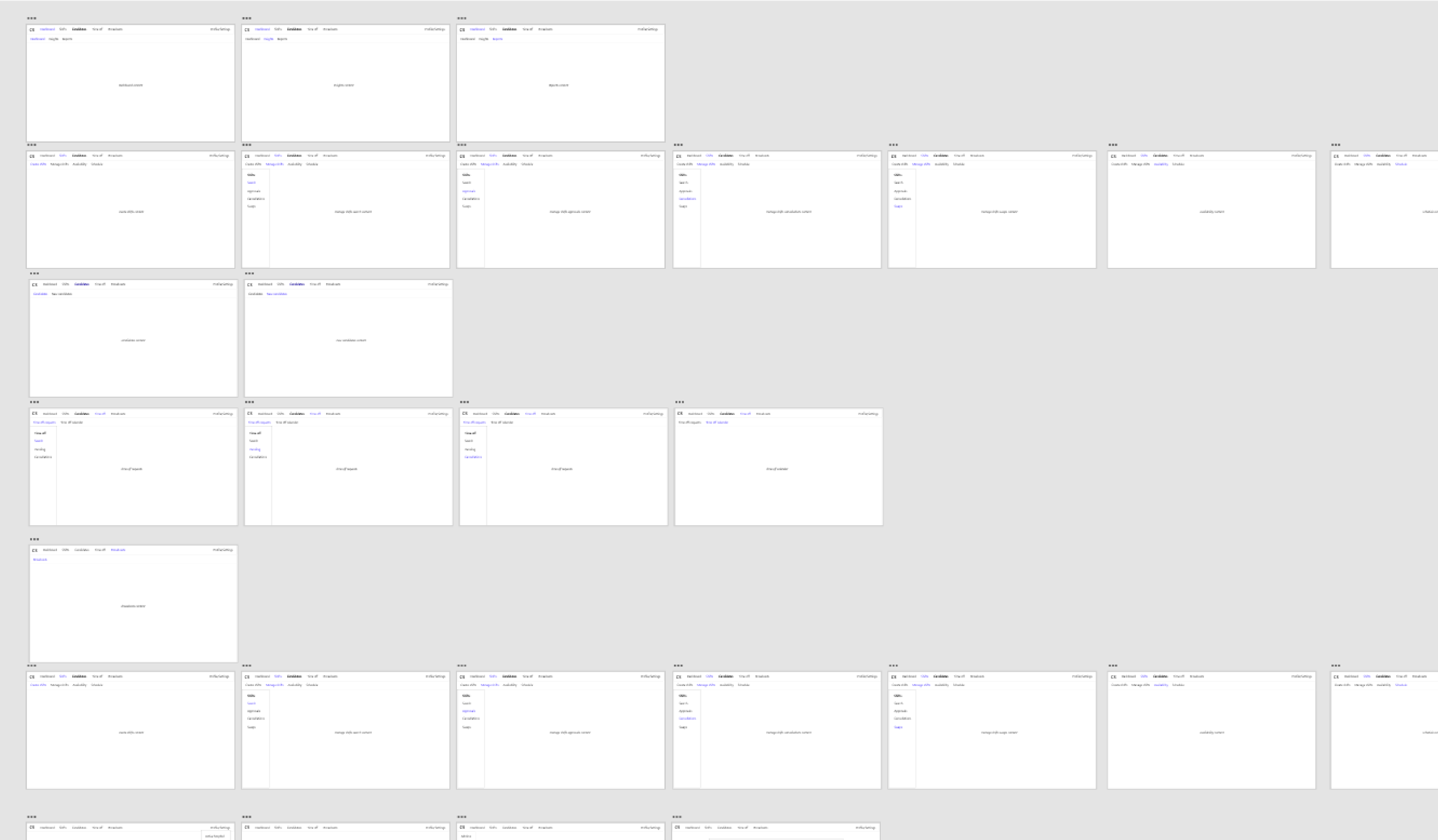
Navigational flow
#1.6
Collaboration
WIREFRAMES
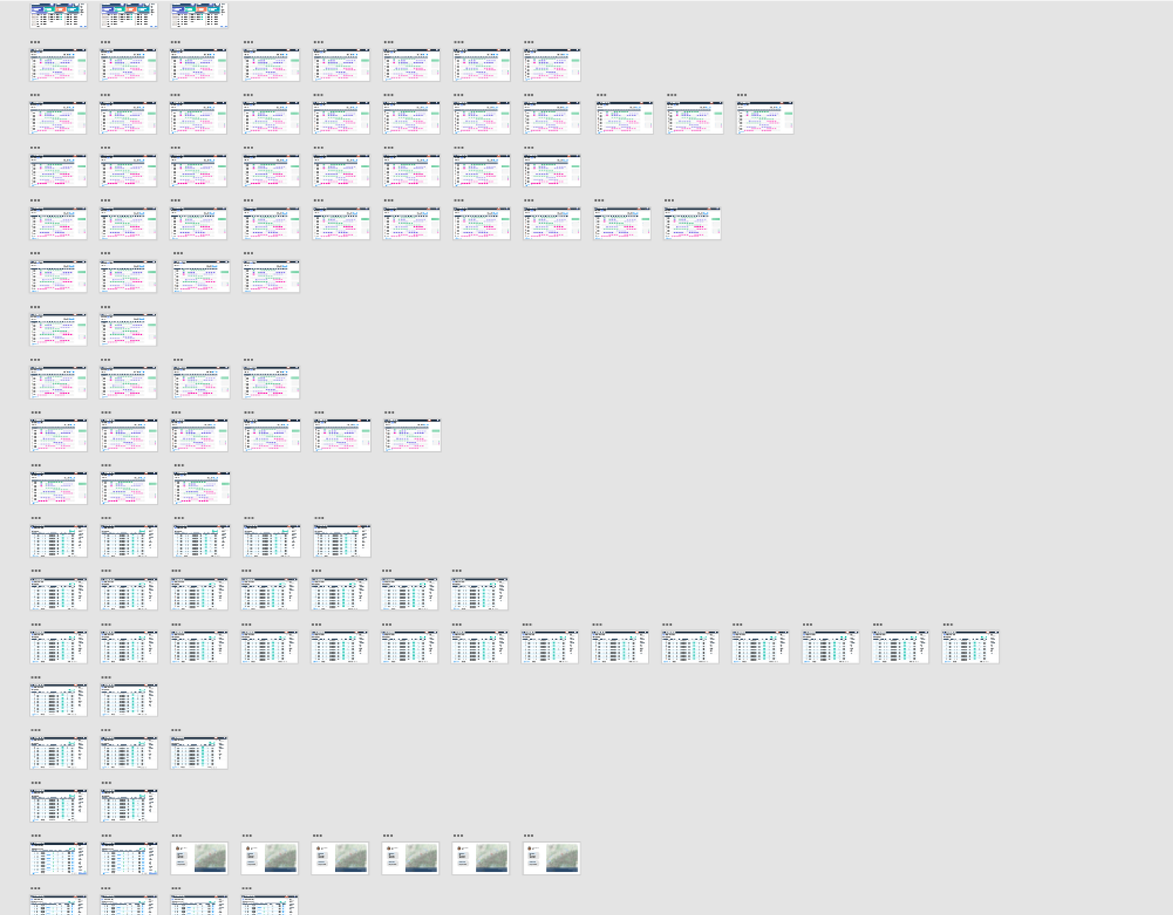
Application flow
#1.7
The workings
WIREFRAMES
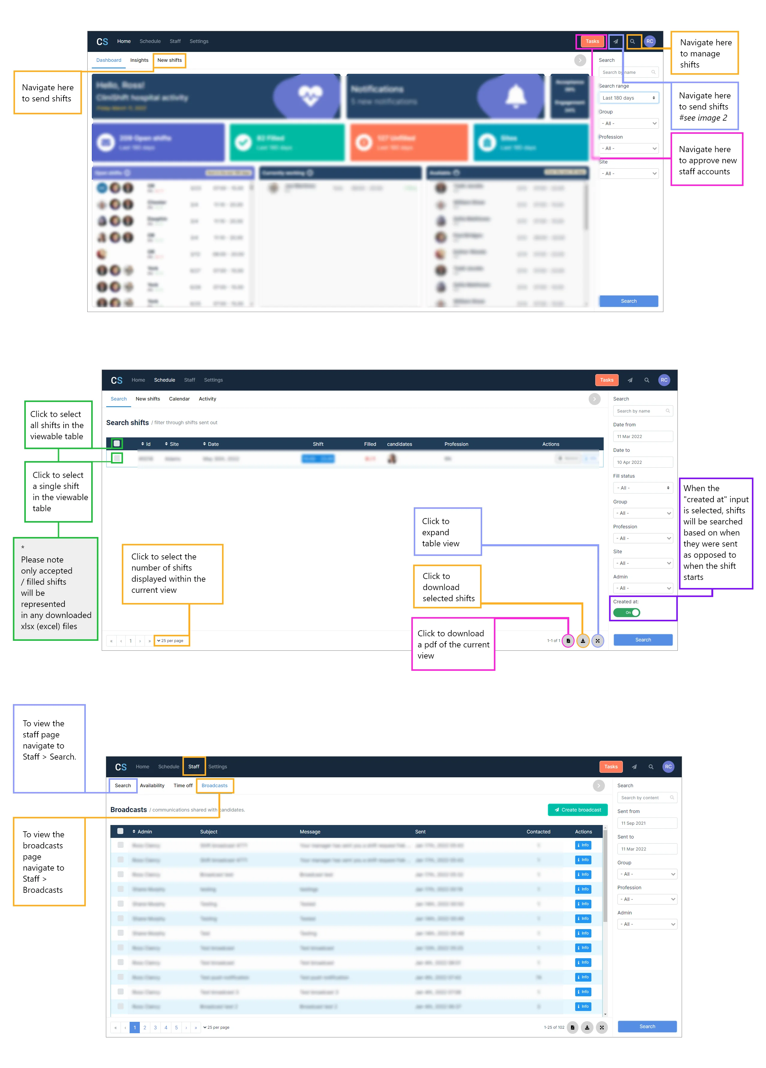
Client
#1.8
Updates
PRINT